MOBHealthcare · New brand
Morristown Braces
A smile you can see coming.
- Sector
- Orthodontics for children, teens and adults, Morristown, New Jersey
- Project
- New brand
- Built on
- Webflow
The challenge
A board-certified orthodontist with a practice to launch, and parents comparing orthodontists online before the first visit.
The brief
An identity as clear and warm as the care, and a site that answers every question before the first visit.
Morristown Braces is a board-certified orthodontic practice in Morristown, New Jersey. It set out to feel clear and warm to anxious parents, and to answer their questions before the first visit.
01 · Project overview
Smiles that feel effortless.
Marina Gonchar is a board-certified orthodontist in Morristown.
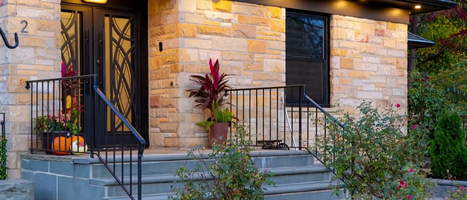
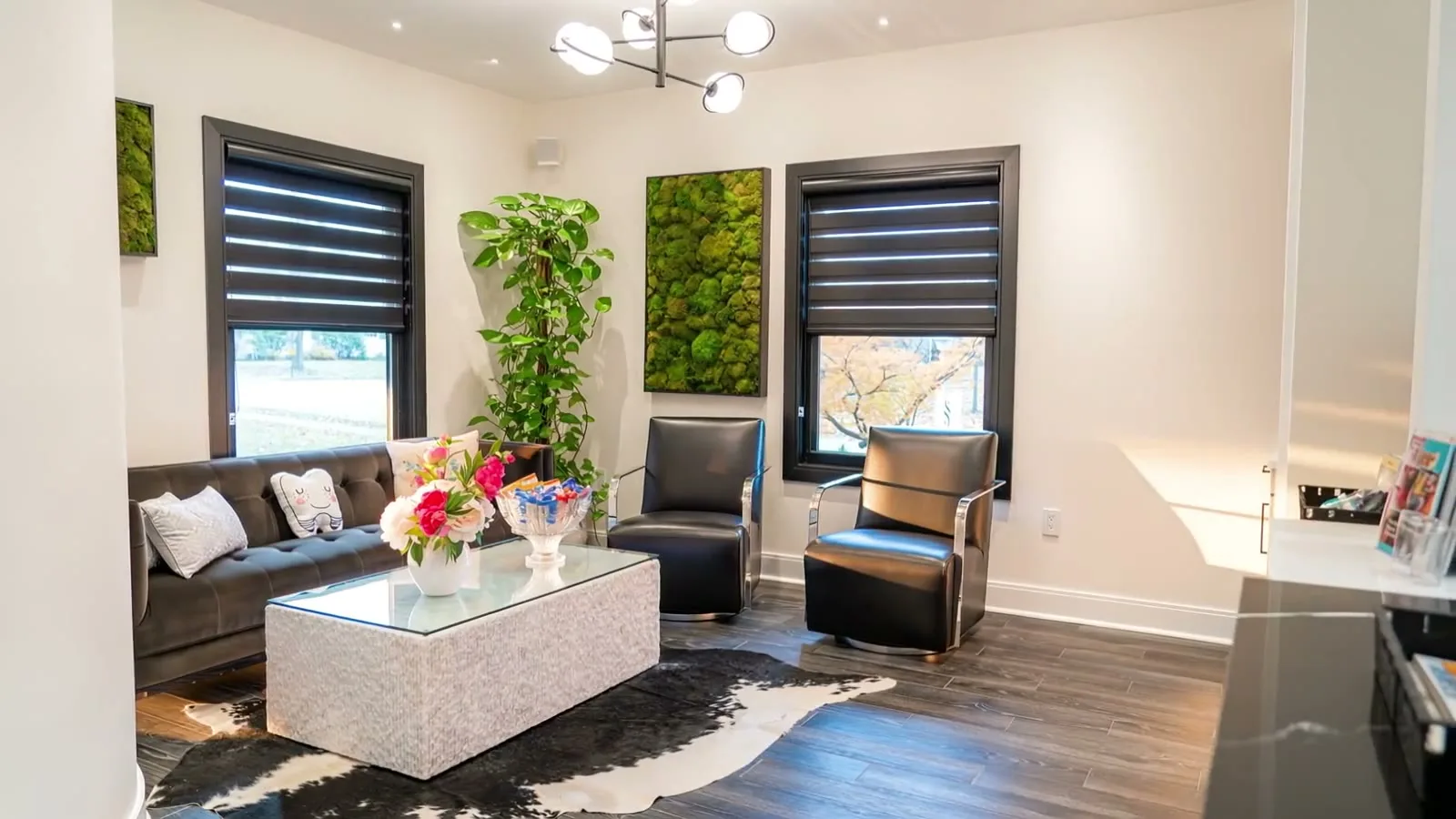
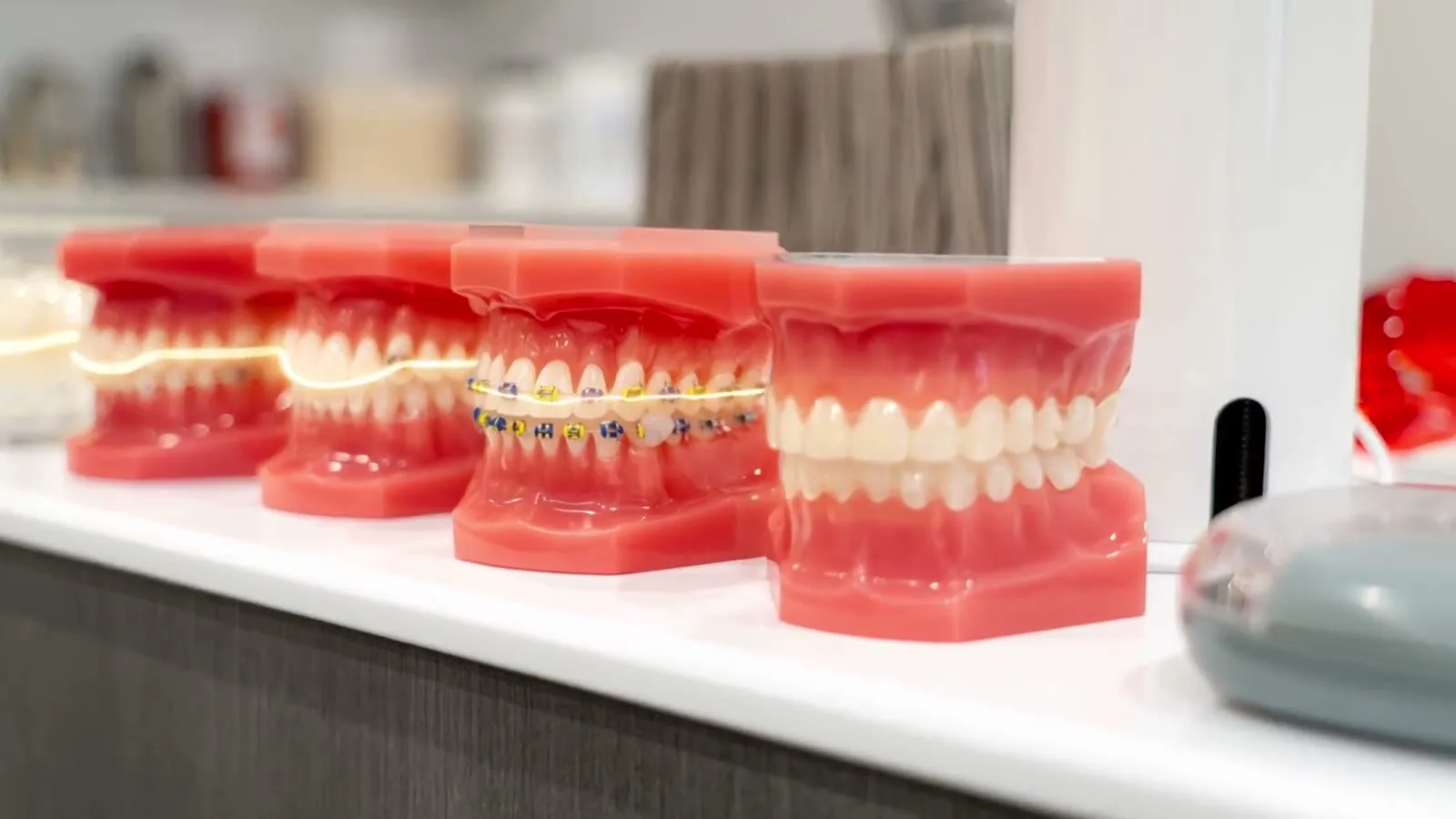
She treats children, teens and adults from a stone-and-brick house at 2 Morris Avenue, with Invisalign, braces, airway and growth care. Most patients arrive through their parents, families across Morris County. She needed a brand and a website that made the first decision easy.
02 · The opportunity
Take the anxiety out.
Parents choose an orthodontist with little to go on.
They compare practices online late at night, and clinical language makes it harder. The strategy set the practice up as the sophisticated choice: clarity, no anxiety, confident next steps. The voice became your friend who happens to be an orthodontist: professional, not cold; confident, not arrogant.
03 · Visual identity
One tooth, one letter.
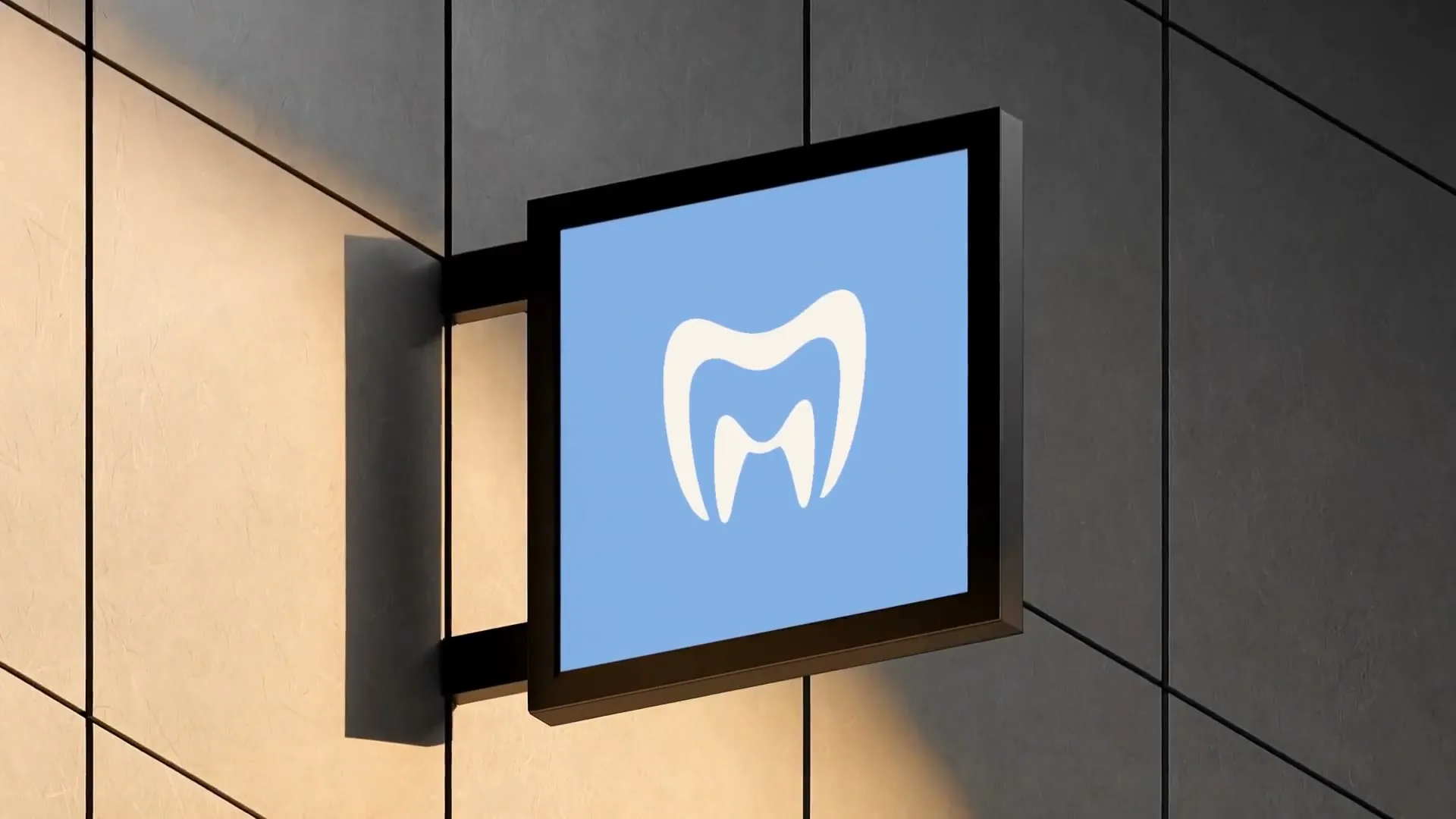
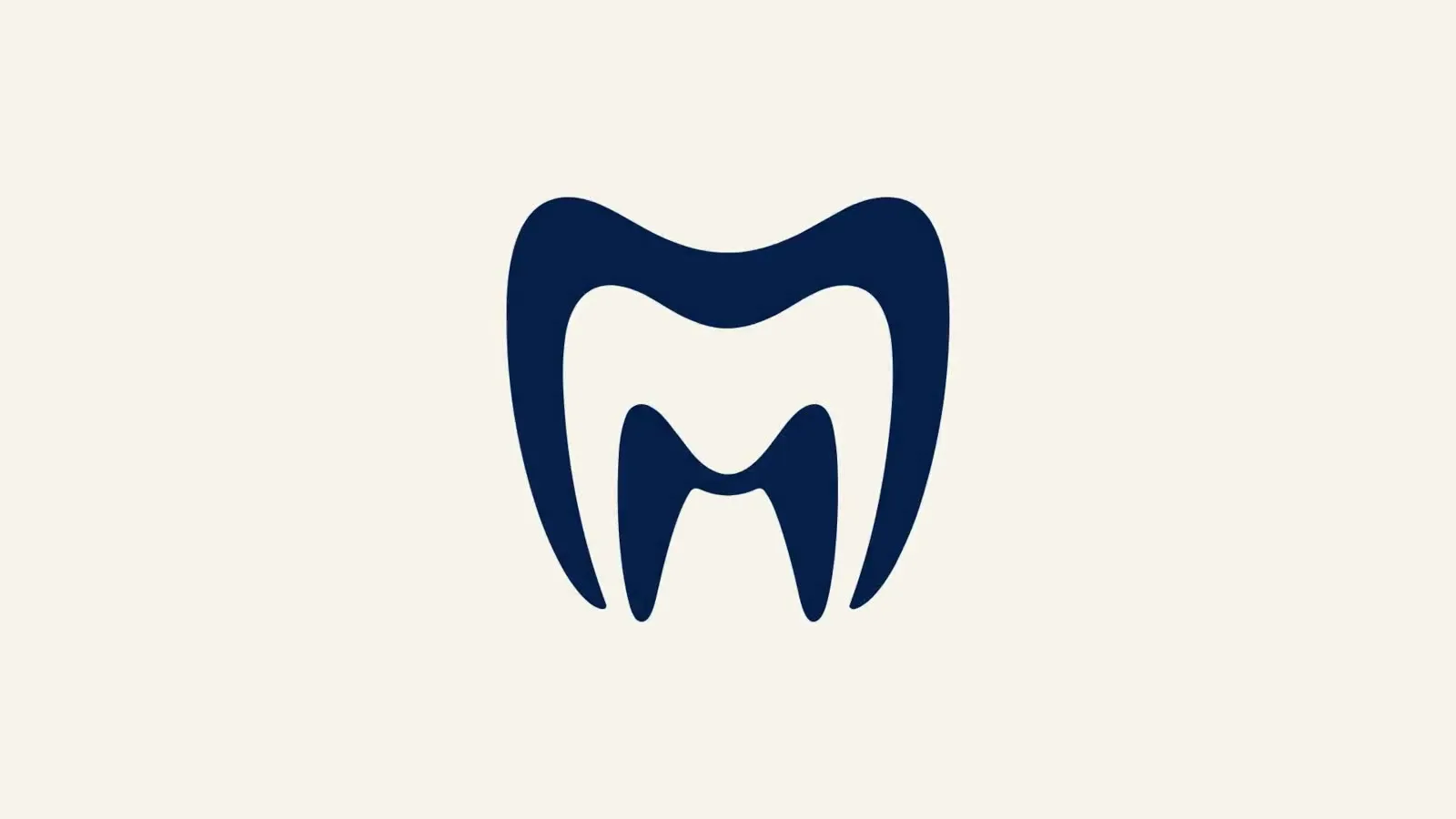
The mark is a single tooth that reads as an M.
Its crown dips softly, like the top lip of a smile, and its two roots stand as the legs of the M. It sits above a stacked serif wordmark, navy on cream, with one pale smile blue. The line through it all is from ear to ear.

04 · The website
Every question, answered.
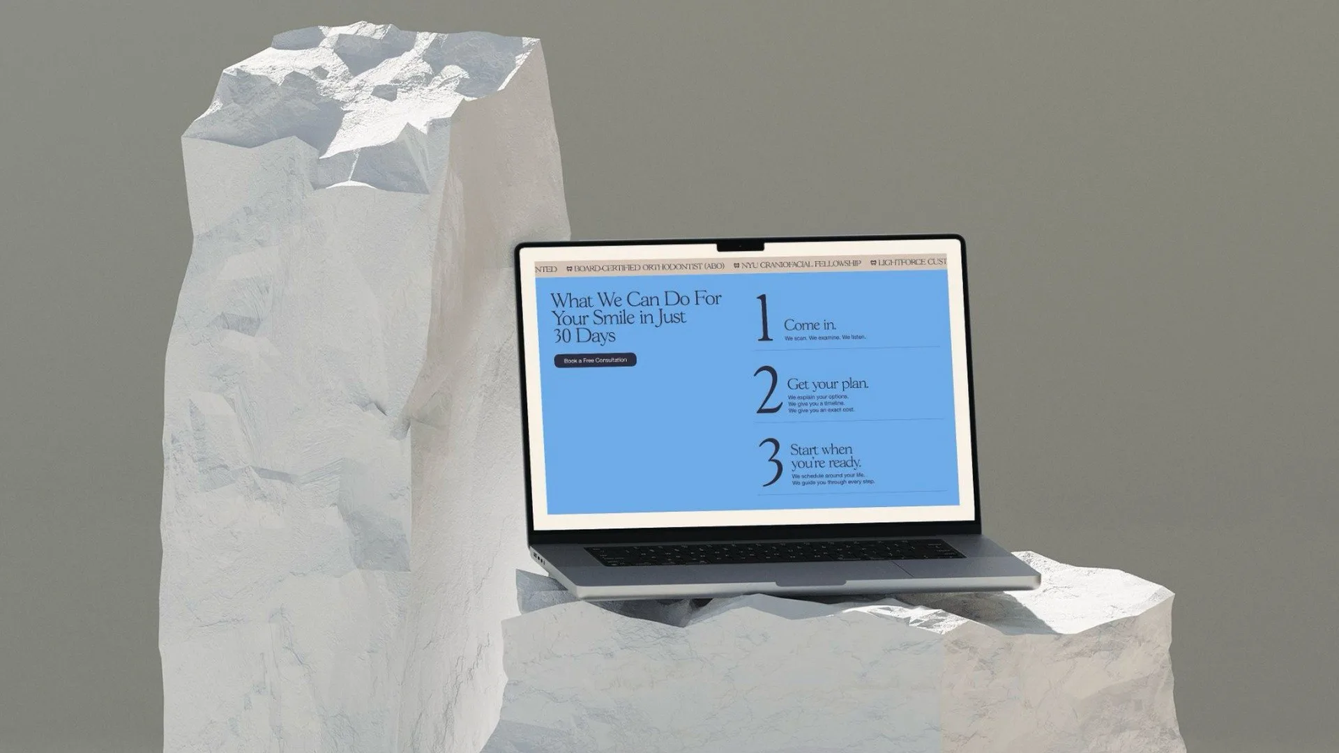
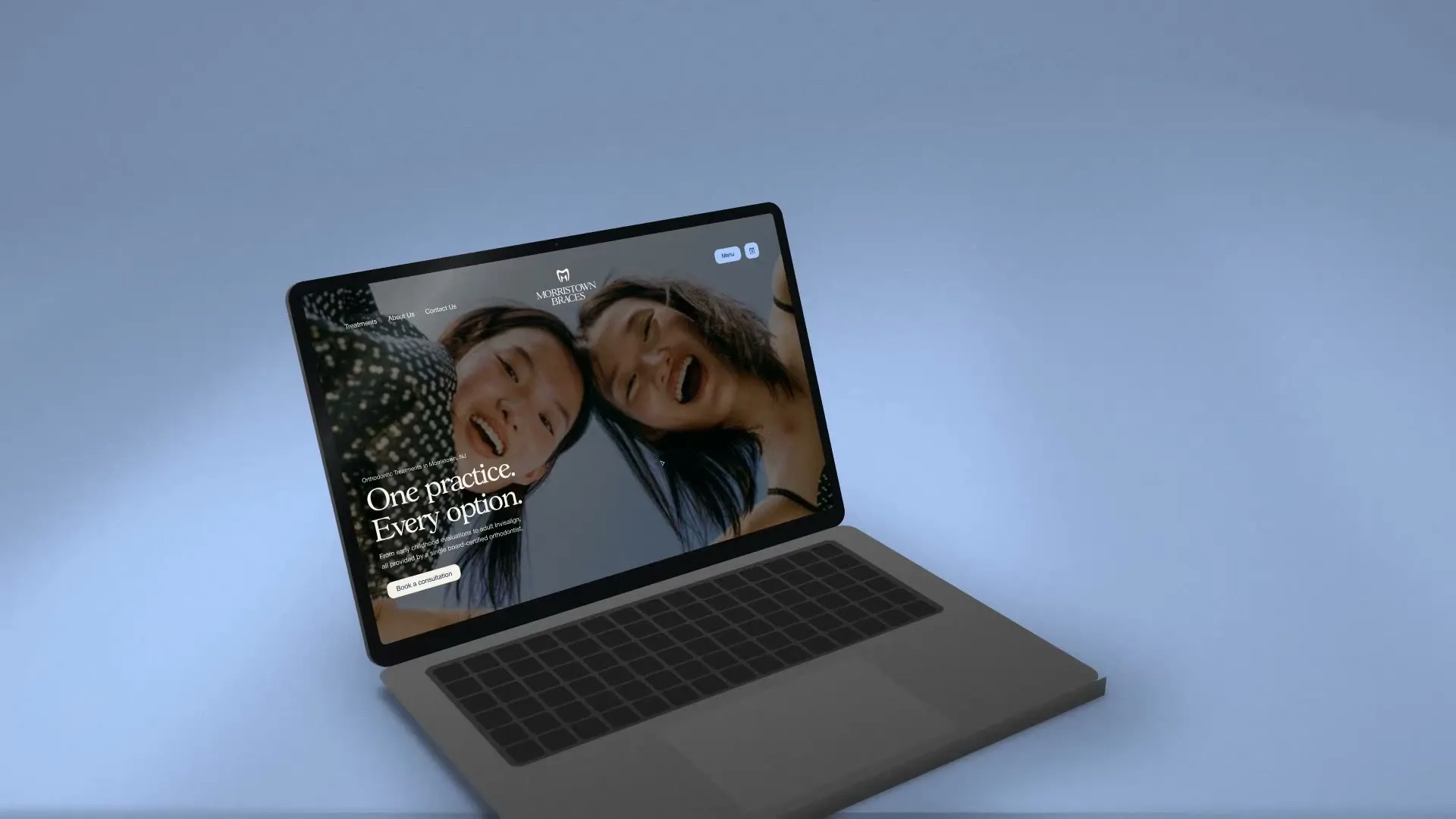
The Webflow site opens on the practice’s own office film.
Its promise: get a smile that feels effortless. Twenty-two pages cover each treatment, treatment by age, airway and growth, surgery, resources and referrals. Tabs turn a parent’s concern into its solution, reviews are sorted by treatment, and every page has an FAQ.
05
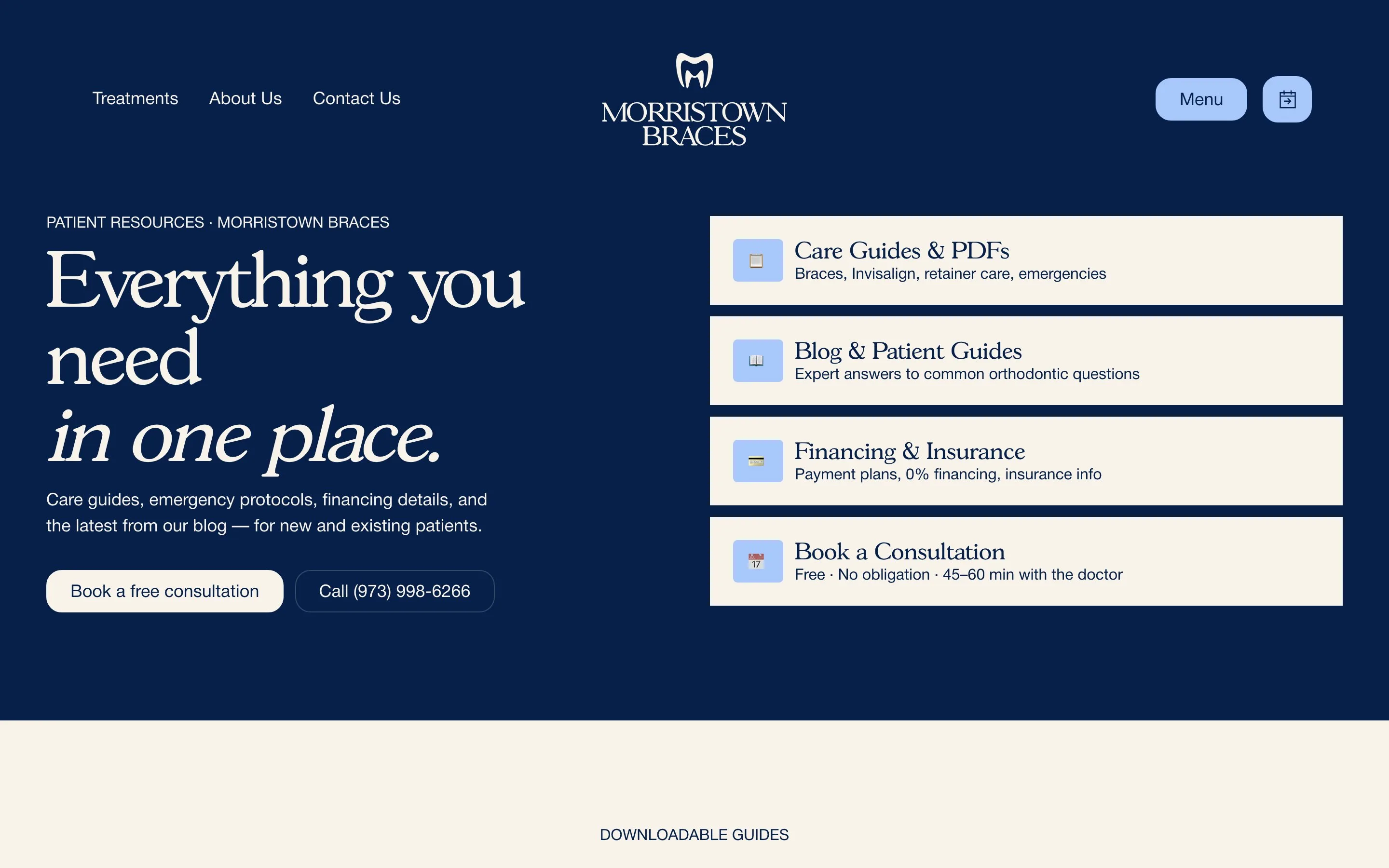
Clear, not clinical.
Navy, cream and a pale smile blue, a custom serif and a voice with no jargon.
06 · Hers to run
Built to be edited.
Behind the site sits a style guide and a component library.
New pages match the old ones without a designer. Since July 2026 the practice has had full editing rights, and it edits and publishes its own pages.
What changed.
One mark for the practice, and a site that answers parents before the first visit.
What we did
- Strategy and positioning
- Tone of voice guide
- Messaging
- Sitemap
- Website copy
- Tooth-and-M mark
- Wordmark and logo suite
- Color palette
- Identity boards: app icon, monitor, laptop, card, sign, social
- UX and interface design
- Webflow build
- Concern-to-solution tabs
- FAQ on every page
- SEO audit and schema plan
- Style guide
- Component library
- Handover
Running a business like Morristown Braces?
Tell us where you are and where you want to go. It starts with a conversation, then your Flight Plan in writing.
- Like
- Morristown Braces
- Via
- Any industry
- Class
- Brand identity, Websites
- Gate
- New Jersey
LanFam Health
A family’s formula, found by the people looking for it.