
MBBProfessional services · Rebrand
Manice Budd & Baggett
A brand built to last, and a website rebuilt to match.
- Sector
- Trusts and estates law firm, Manhattan
- Project
- Rebrand
- Built on
- Webflow, then Astro on Cloudflare
The challenge
A respected firm whose clients usually arrive by referral, already knowing the name.
The brief
Look as assured as the firm’s reputation, and read easily for every client.
The result
100Accessibility scoreLIGHTHOUSE · AUG 2026Launch measurements that show the quality of the build, not traffic. Most of the firm’s visitors arrive by name.
- 72%
- Lighter images site-wide, from 9.8 MB to 2.7 MBLaunch audit, Aug 2026
- 11 of 11
- Old links redirected, none broken at launchLaunch audit, Aug 2026
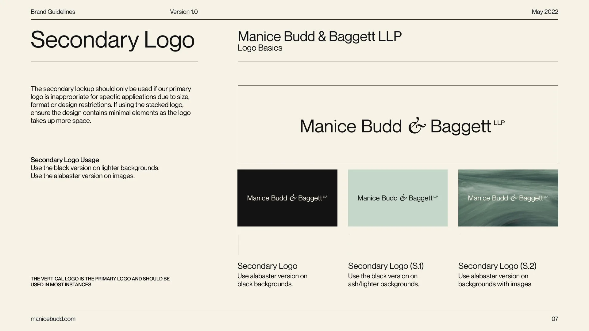
Manice Budd & Baggett is a trusts and estates law firm in Manhattan. It set out to look as assured as its reputation, and to read easily for every client who comes to it.
01 · Project overview
A name clients already know.
Manice Budd & Baggett is a Manhattan firm that advises families on estates, trusts and charitable giving.
Its clients usually arrive by referral, already knowing the name. The website is rarely where they first hear of it. It is where they check, before they call, that the firm is as steady as they were told.
02 · The opportunity
Quiet, assured, and easy to read.
A trusts and estates firm should never look loud.
Its clients are often older, reading at a difficult moment, and need the right practice quickly. In 2022 the brief was an identity modern but settled, quiet but confident. In 2026 the brief changed: keep the face clients knew, and rebuild how the site reads.
03 · Visual identity
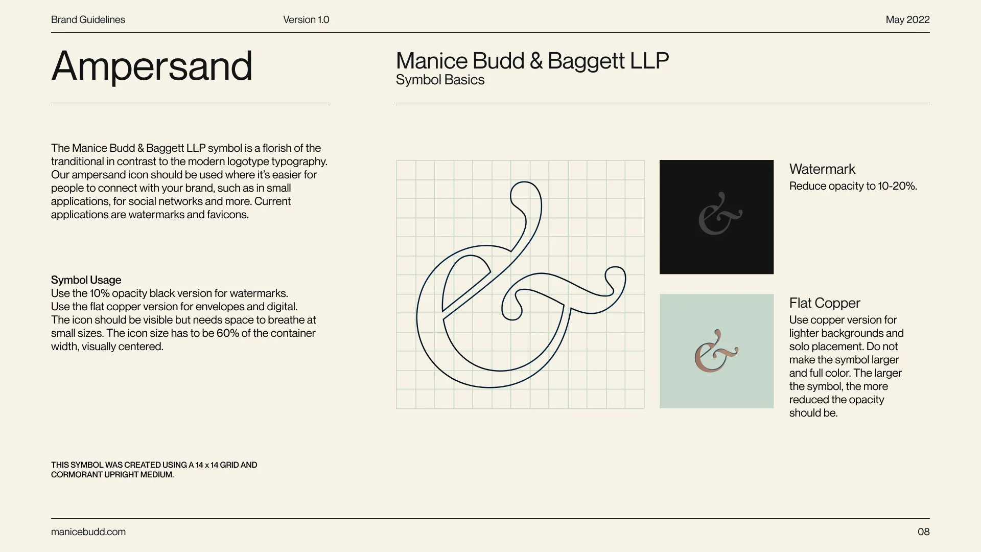
An ampersand with a signature.
The wordmark is clean and modern, with one exception: the ampersand.
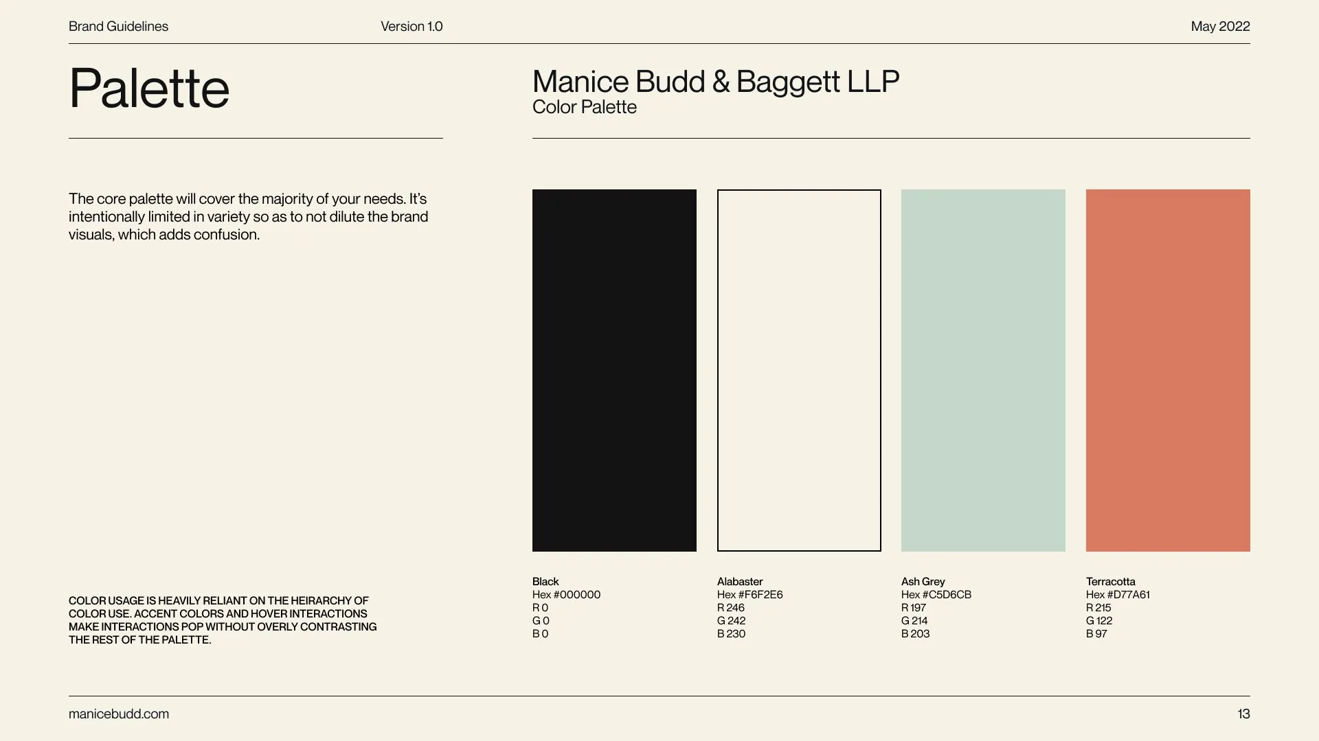
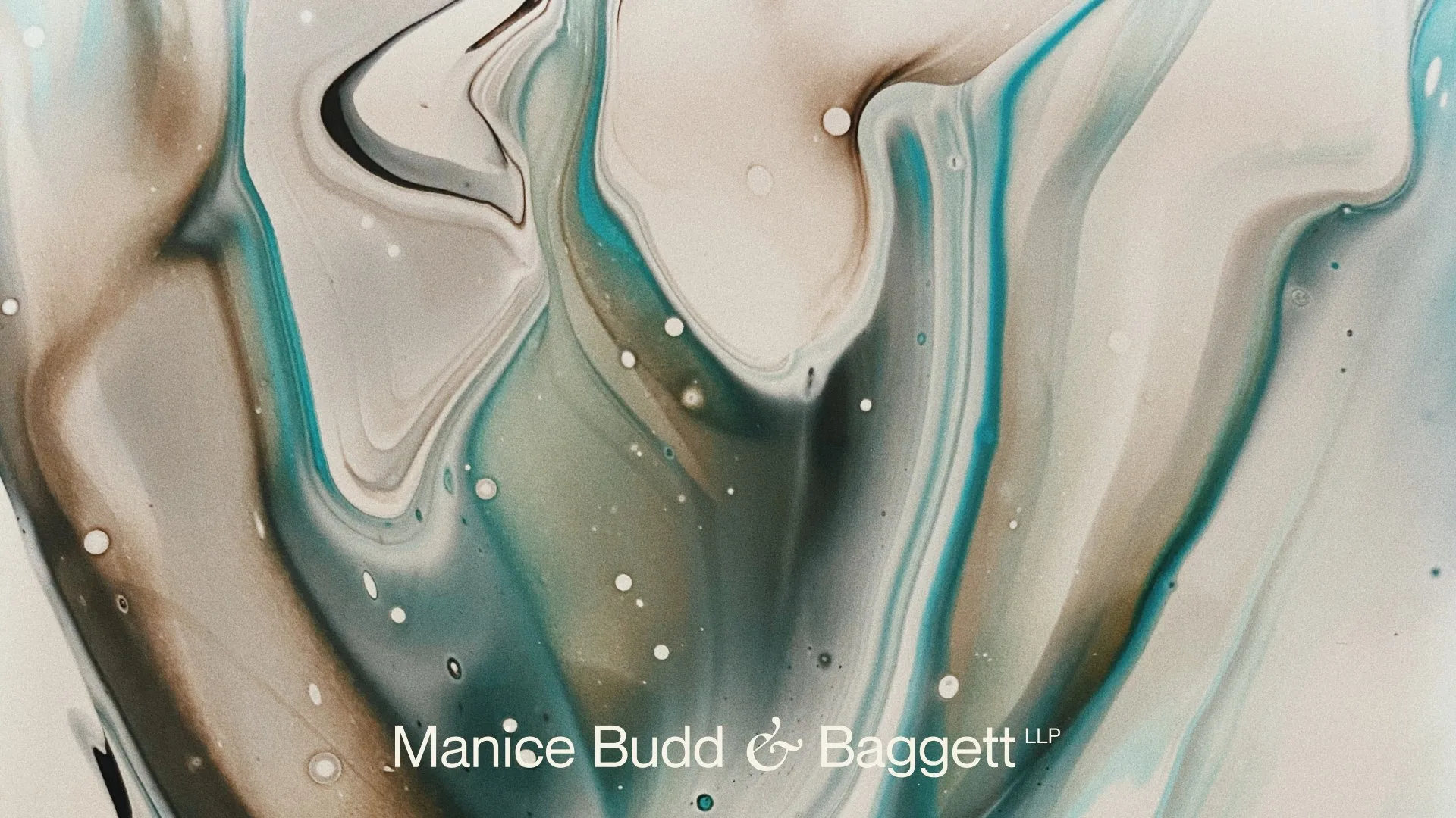
Drawn as a script flourish, it reads like a signature at the foot of a letter. It became the firm’s mark in its own right, on every practice title and card. Cream, near-black and sage carry the work, with one terracotta accent.

04 · The website
Same face, better reading.
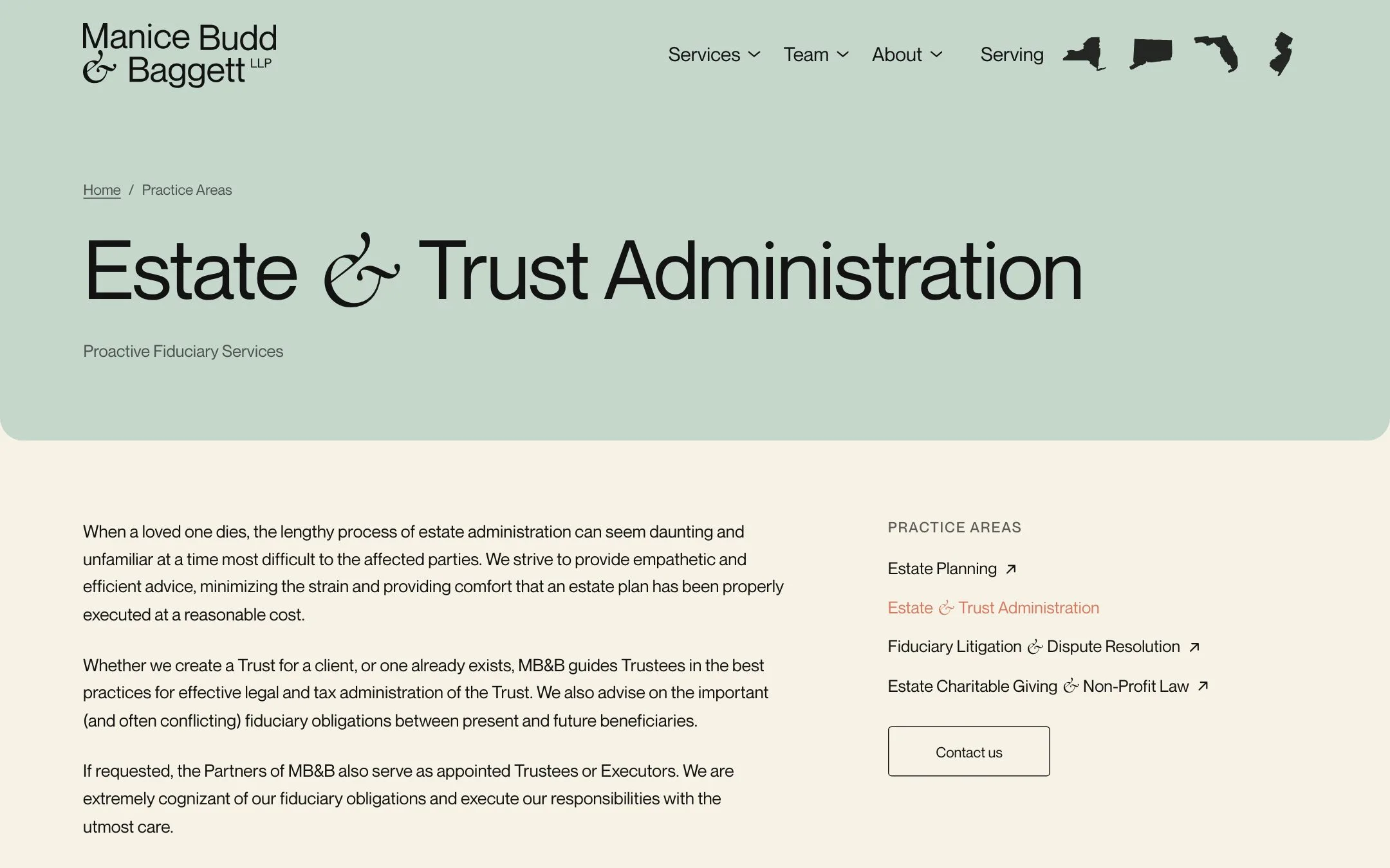
In 2026 we rebuilt the site and kept the look.
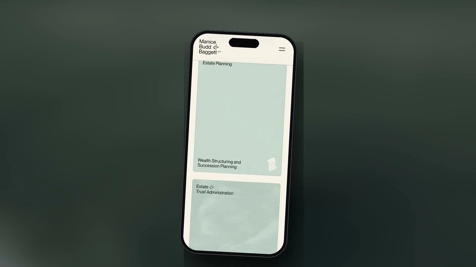
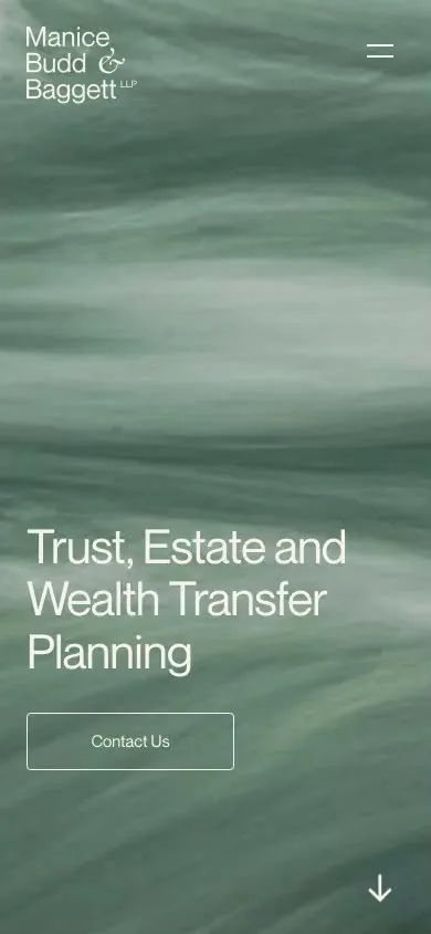
The type is larger, the lines a comfortable length, and every menu works by keyboard and touch. The accessibility score reached 100, and images are 72% lighter. The site moved to its own fast hosting, every old link was redirected, and email never went quiet.
05 · Its pages
A page for every practice.
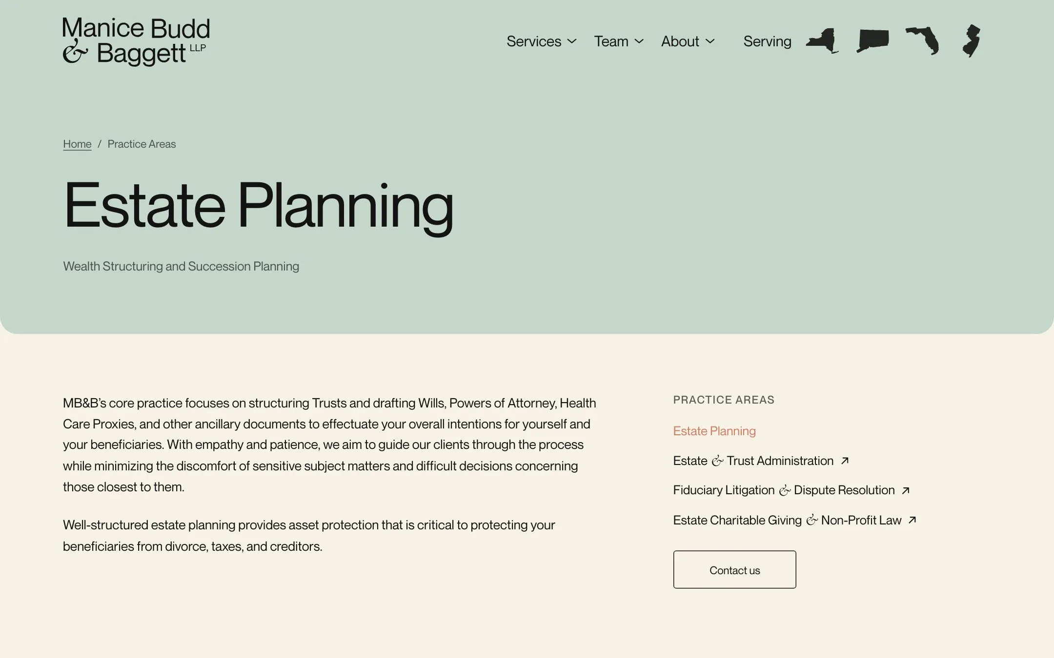
Each of the four practices now has its own page.
Estate planning, trust administration, fiduciary litigation and charitable giving each carry the ampersand in their titles. The team and the firm’s story have pages too. And for the first time there is an inquiry form, with an email fallback, so no inquiry is lost.
06 · In use
The brand, beyond the site.
The identity was built to travel beyond the site.
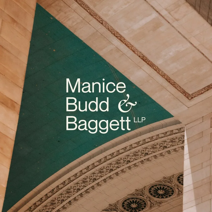
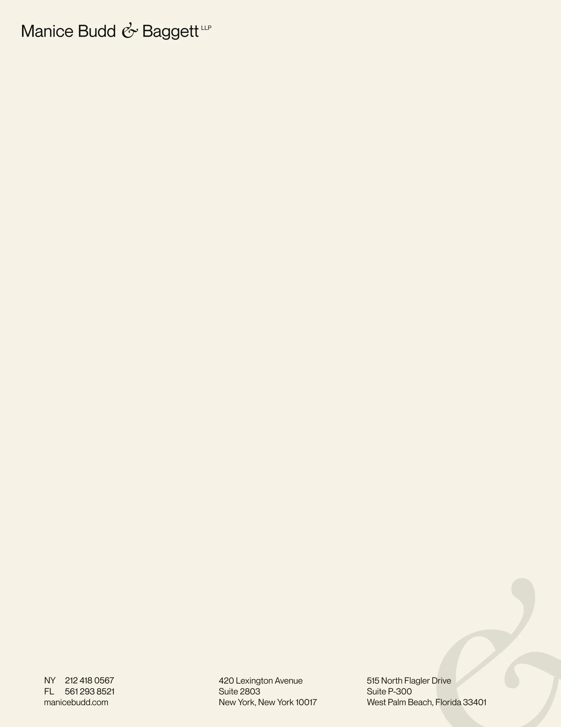
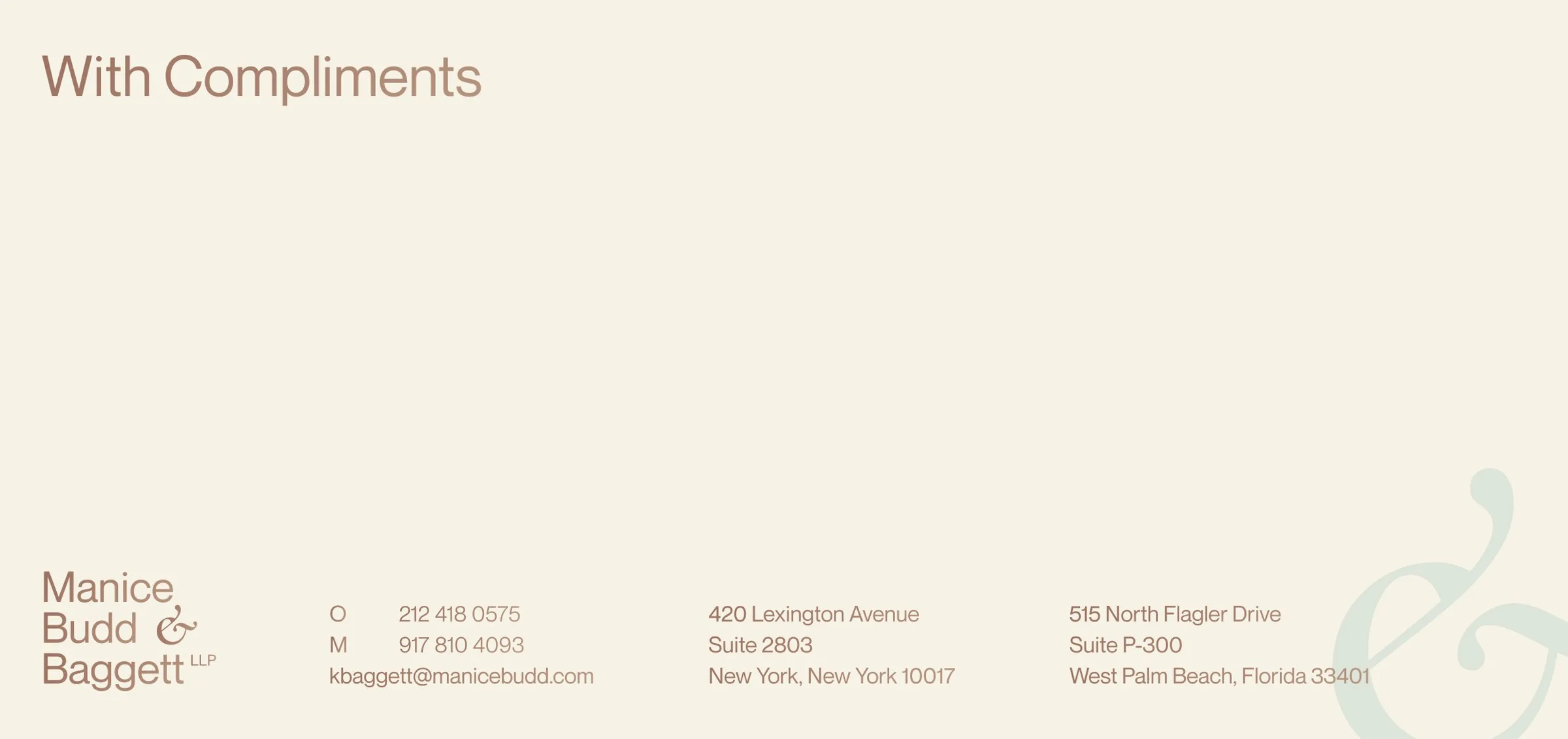
The guidelines cover the cards, letterheads, envelopes and compliment cards the firm uses daily, in cream and sage. In 2026 we put the brand onto LinkedIn, with twenty-nine templates for appointments, talks and firm news. Anyone at the firm can make a polished post in minutes.
What we did
- Brand strategy
- Website plan
- Accessibility review
- Wordmark and ampersand
- Secondary logos
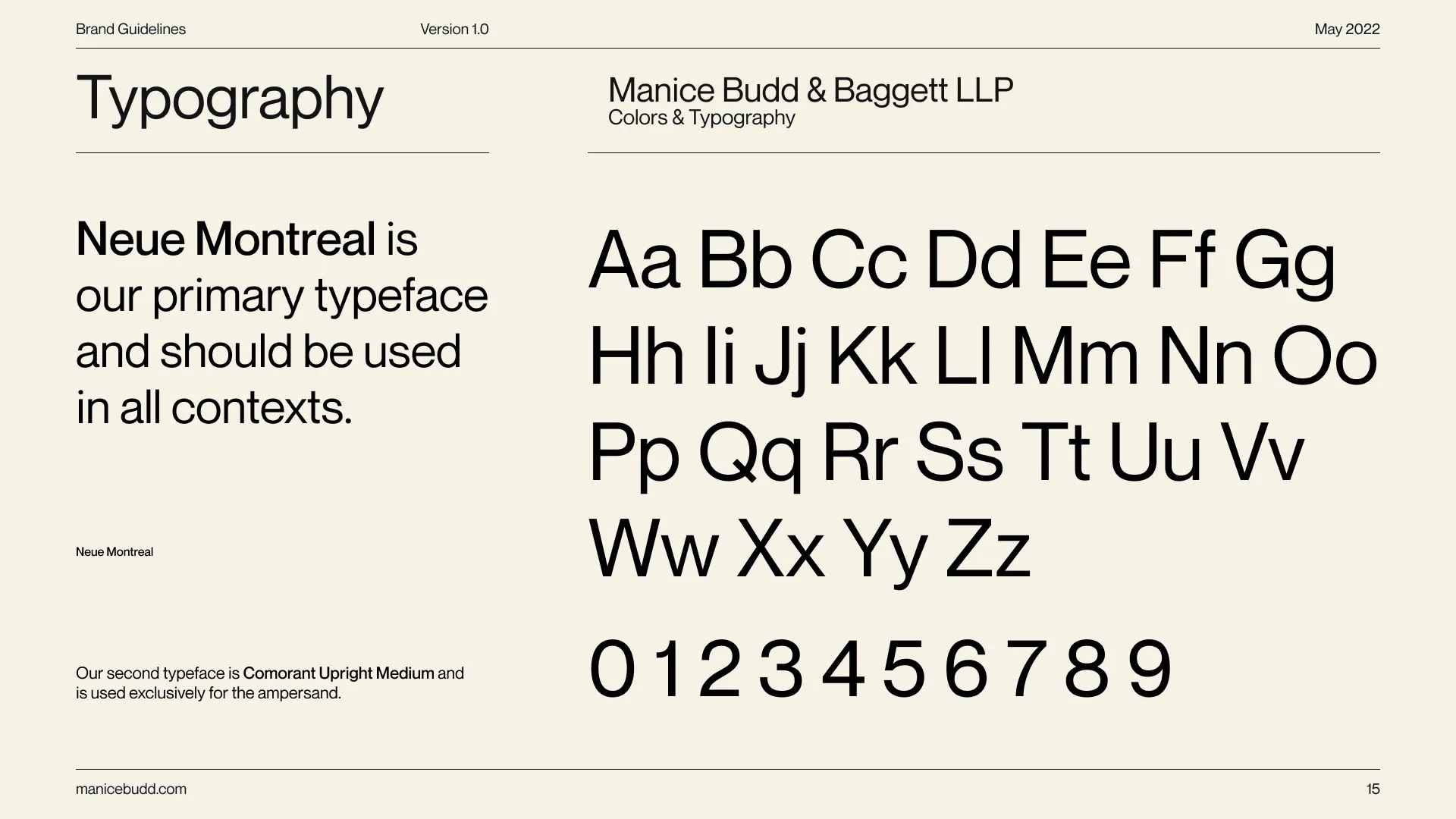
- Color and typography
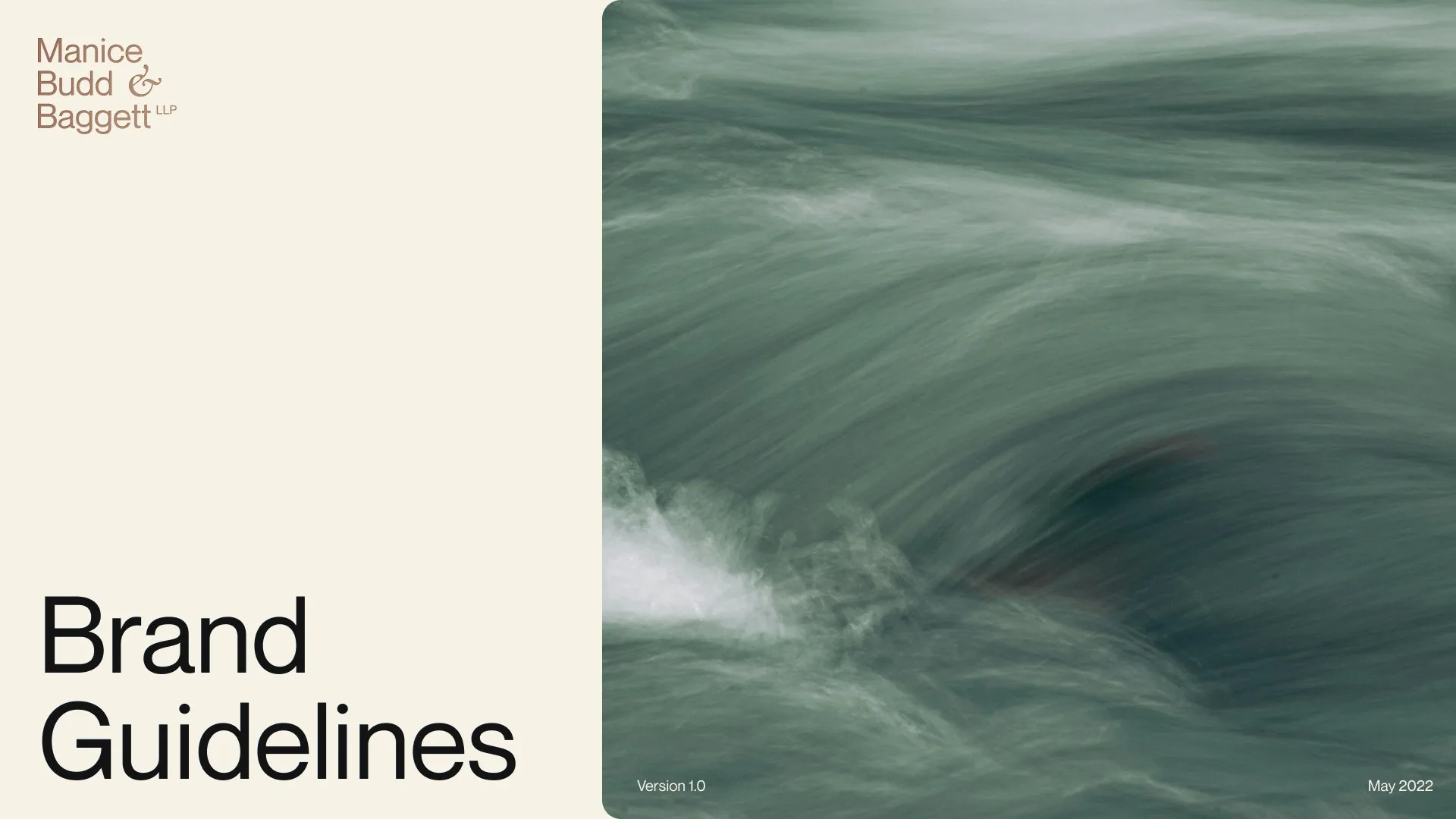
- Brand guidelines
- Stationery
- Rebuild on fast hosting
- Accessible type and navigation
- Image optimization
- Redirects and email-safe move
- Four practice pages
- Team and about pages
- The firm’s first inquiry form
- Stationery suite
- 29 LinkedIn templates
Running a business like Manice Budd & Baggett?
Tell us where you are and where you want to go. It starts with a conversation, then your Flight Plan in writing.
- Like
- Manice Budd & Baggett
- Class
- Brand identity, Websites
- Gate
- New York City
Abraham Burickson
A homepage that takes you for a walk.